The Making of a Premium Travel Brand

Building a Luxury Editorial Identity Under Constraint
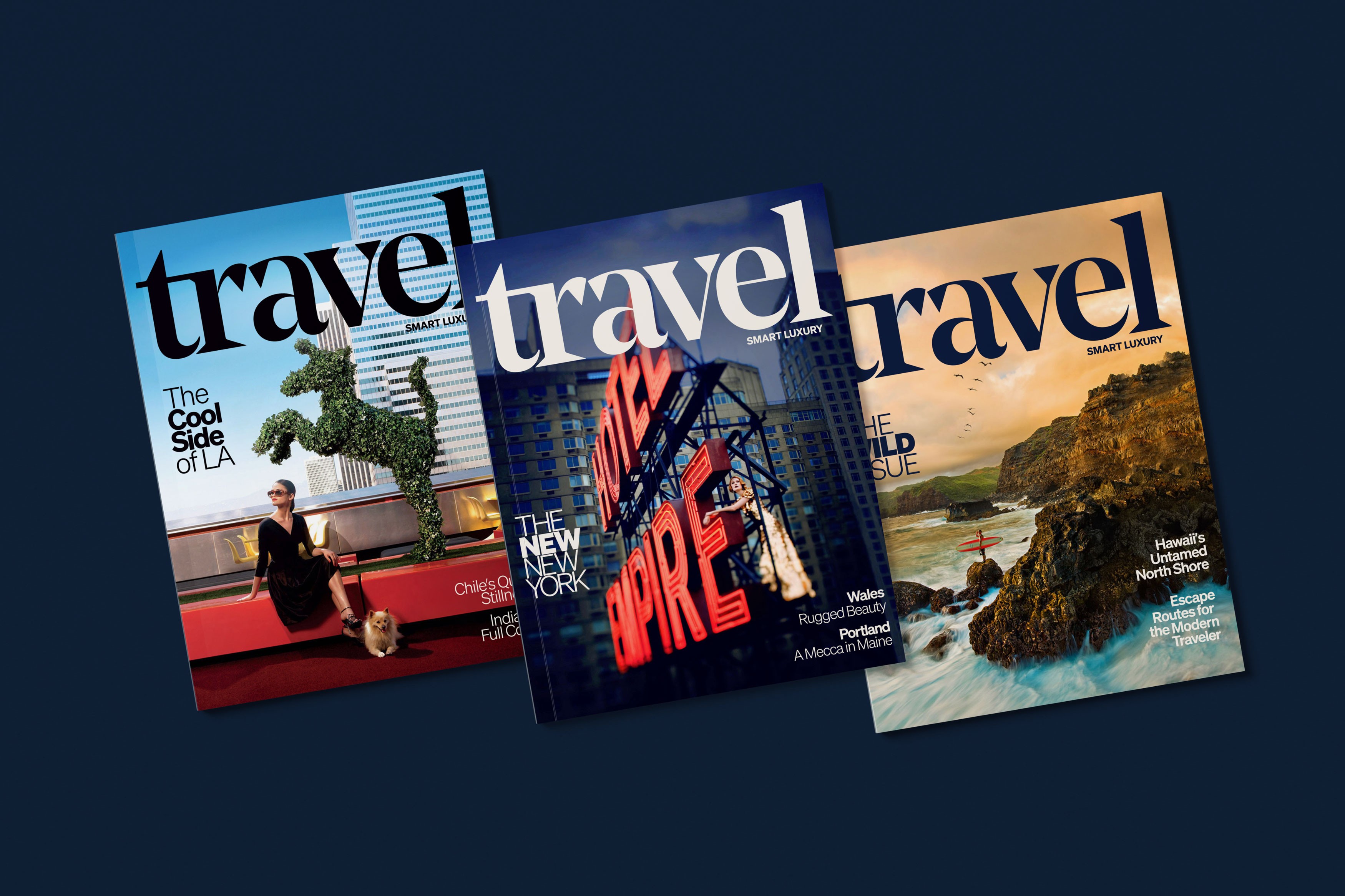
When I came in as Creative Director of Smart Luxury Travel, the brief was to build a premium print magazine sent to subscribers of Sherman's Travel, a discount travel site. The gap between what it was supposed to feel like and what it actually looked like was significant. The photography was all stock, nothing held together as a package, and the visual identity had none of the confidence the name implied.
Changing the photography model
The first thing I changed was the photography. Shooting everything original was the obvious answer but the budget wasn't there, so my photo editor and I built a model that made it work anyway. We approached top photographers with a different offer: a comped week at a featured destination, flights, hotels, and meals covered through editorial partnerships with airlines and properties, in exchange for a few hours of shooting each day. They got a working vacation. We got original photography at a fraction of what stock was costing. The budget dropped from over forty thousand per issue to under twenty, and the quality went up significantly.
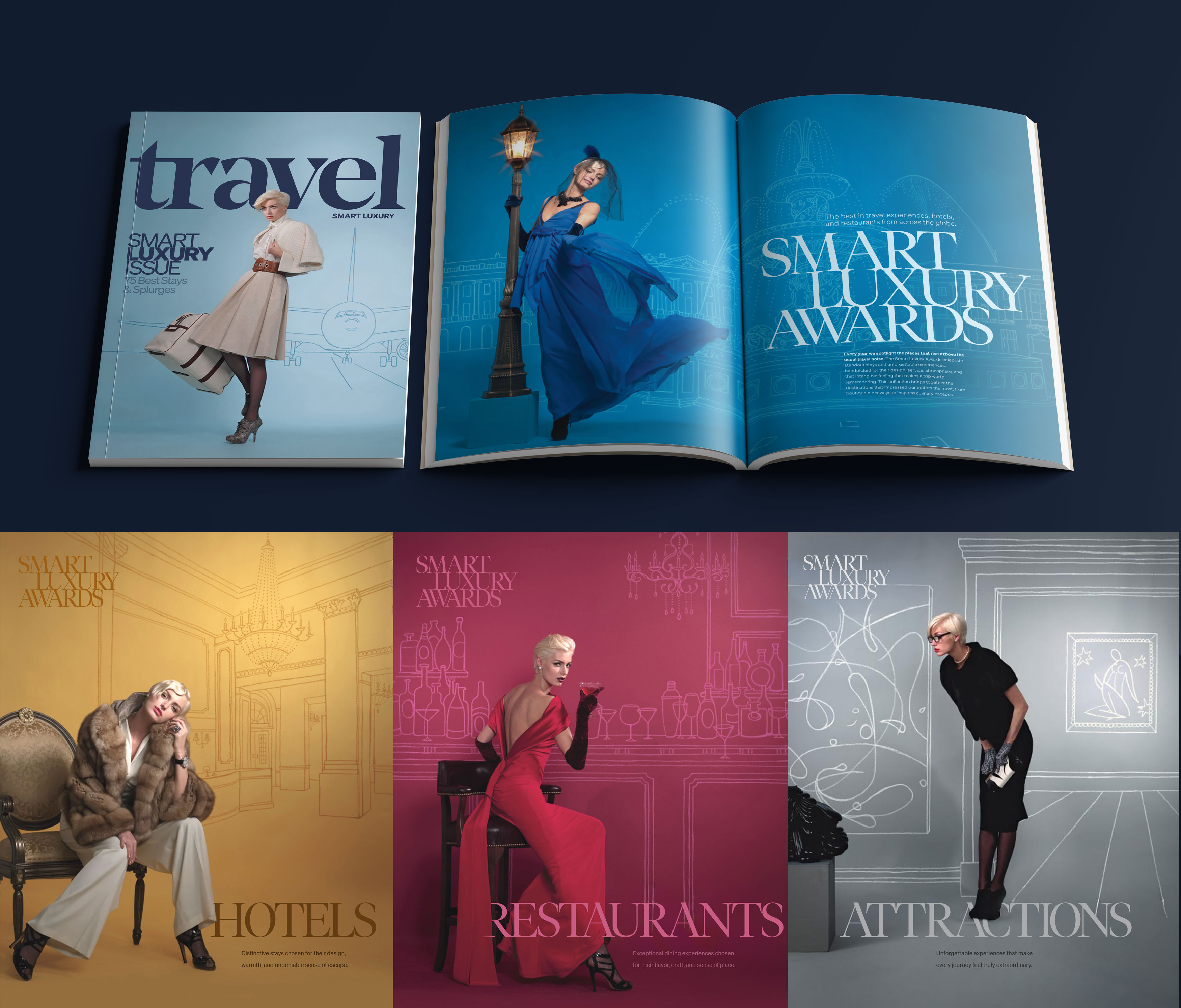
The Smart Luxury Awards shoot
For the Smart Luxury Awards issue we had even less to work with, so we leaned into concept. The shoot followed a single woman, a jetsetter moving through the world the magazine celebrated. On the cover she's on the tarmac heading to a plane. Inside, four sections each got their own environment, all hand drawn by an artist as large sweep backdrops, with one prop per shot to anchor the scene. A street lamp on a European piazza for the opener. A barstool at a bar for restaurants. An oversized lobby chair for hotels. A sculpture borrowed from a local gallery for experiences. The results looked like a fully produced campaign. They weren't.
Branding the visual system
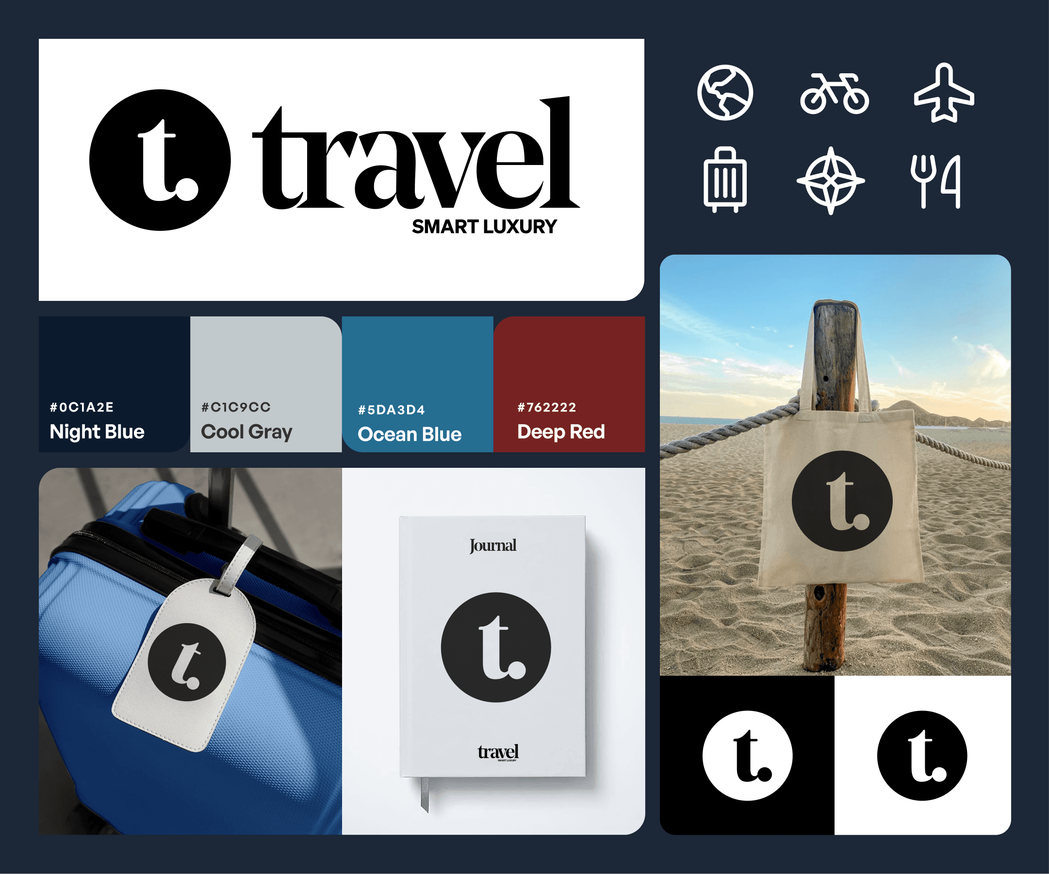
The color system, typography, and photography direction were all built during the engagement. I developed a palette centered on deep blue, cool gray, and a warm accent red, paired with a confident masthead and a tight serif and sans combination. That foundation carried through every issue and gave the magazine a consistent premium tone it hadn't had before. The logo, monogram, and branded product shown here represent the complete vision, finished afterward to show where the identity was always headed.
Taking it digital
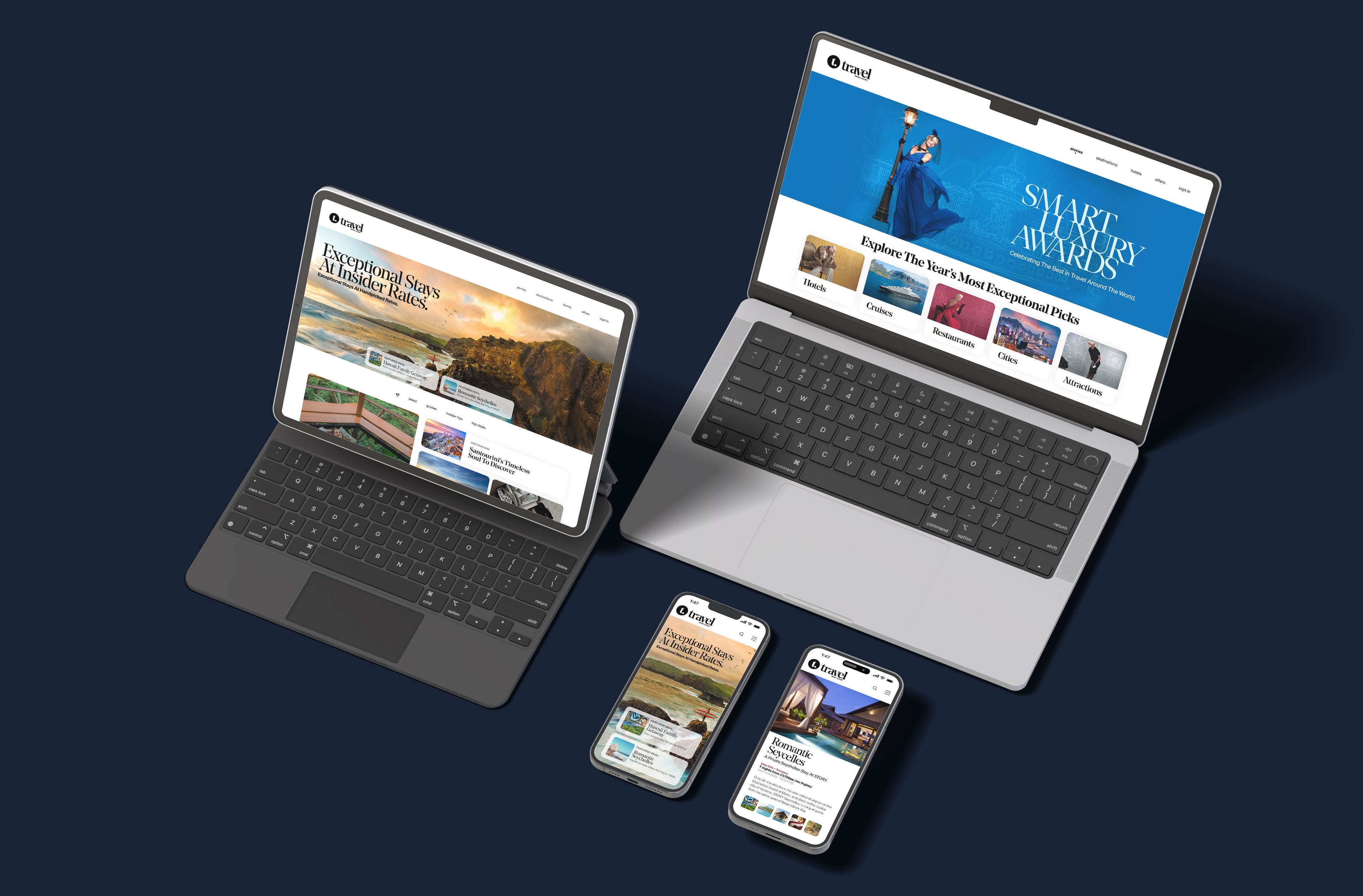
Toward the end of my time there we began extending the brand into a dedicated Smart Luxury Travel section on the site. I prototyped a responsive web experience that brought the same editorial confidence into a digital format, covering desktop, tablet, and mobile. The layouts shown here are based on that work, updated to current standards. The structure and direction were there. The execution just needed time the engagement didn't have.
The publication had real creative potential. It also had a publisher and editorial team who were more comfortable keeping the art department in its lane than letting it lead. Some of the best work happened anyway. The rest got finished later.
Key takeaway A constrained budget is a creative problem, not a creative limit. The strongest editorial work here came from finding ways to do more with less while keeping the visual standard high enough that nobody could tell the difference.
date published
19 Nov 2025
reading time
5 min


