Designing Smarter Video Moments

Content strategy goes beyond producing content and placing it on a page.
It's about understanding the role video plays within the broader experience. The best videos don't exist in isolation. They support a story, create an emotional connection, explain something complex, or encourage users to explore further.
A good strategy respects the moment a user is in. Not every video belongs in a hero slot and not every story should be pushed upfront. The goal is to create enough curiosity and value to earn a user's attention, then give them a clear path for what comes next.
Too often, video is treated as a destination. The strongest experiences treat it as part of a larger content journey, helping users move naturally from discovery to deeper engagement.
Example one: Using Video Bumpers to Build a Content System
At Men's Health, we needed a clear way to organize a growing library of content spanning fitness, fashion, health, food, and entertainment. Rather than treating each video as a standalone asset, we created a simple system of color-coded bumpers that introduced every clip. Blue represented fashion, orange fitness, red health, green food and drink, and yellow entertainment.
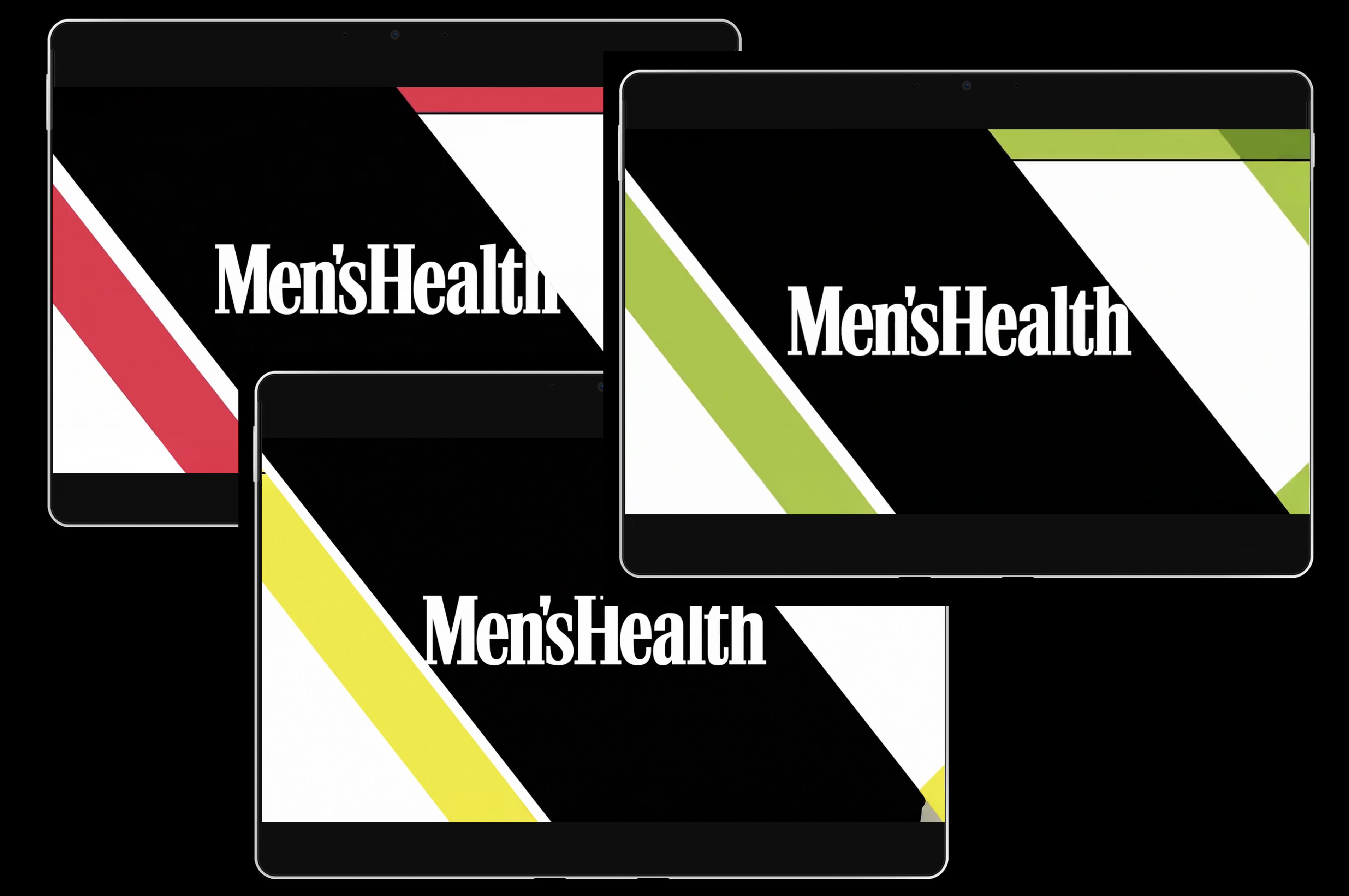
While the bumpers only lasted a few seconds, they played an important role within the broader content strategy. They gave users immediate context, created consistency across the website and app, and helped people quickly understand what type of content they were about to watch.
A good example was the Holy Shit Kitchen Tricks series. The bumper established the category, set the tone, and introduced the personality of the content before the story even began. It was a small design decision, but one that helped connect hundreds of individual videos into a cohesive experience.
Example two: Creating Momentum Through Content
One of the challenges with content strategy is understanding where different types of content belong. Not every story needs to be told in full immediately, especially on a homepage where users are still deciding whether to engage.
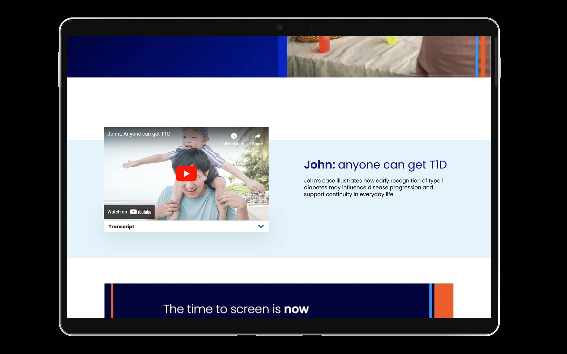
In this example (above), the original homepage placed a six-minute testimonial video directly into the hero area using a standard video player. While the story itself was meaningful, the presentation was visually flat. The static poster image was partially obscured by player controls, creating little emotional connection and giving users no immediate reason to engage. At the same time, they were being asked to commit to a long-form video before understanding why it mattered, and even if they watched it, there was no clear path to related content or deeper exploration. The experience asked for attention without first earning it.
My solution flipped the pattern (above). Working with engineering, I used a four-second silent looping clip that delivered an immediate emotional cue while maintaining a footprint similar to a static image. The moment between a father and son communicated the benefit in seconds, helping users understand what the story was about before asking them to invest six minutes of their time. Rather than placing the entire testimonial on the homepage, the clip acted as an entry point, leading users to a dedicated video experience where they could watch the full story and explore related content. The homepage became lighter, the message became clearer, and users had a natural next step if they wanted to go deeper.
Key Takeaway Both examples show that effective content strategy is about more than creating content. It's about understanding the role content plays within an experience. Whether the goal is to orient users, create an emotional connection, or guide them deeper into a journey, the most successful content helps people understand what matters and where to go next.
date published
9 Dec 2025
reading time
3 min read


