Design systems

Design systems that streamline functionality, accelerate delivery, and bring motion and emotion to every interaction.

Problem

Men’s Health wanted to turn its trusted training expertise into a digital experience. The challenge was to guide users through structured programs that adapted to their fitness level, while staying true to the brand’s confident, motivating tone.

Solution

Partnered with Men’s Health editors and trainers to bring expert fitness content to life in a motivating digital experience. Simplified discovery and program flow to help users stay consistent, and delivered a bold, structured app that launched as a 20-day guided plan.

Problem

Four separate global organizations needed design systems that were accessible, consistent, and scalable across their own complex ecosystems. Each company had fragmented patterns, uneven branding, and no reliable way to build or evolve products with confidence. The work ended up informing the next system, but each one started from a different brand, team structure, and set of requirements.

Solution

A unified approach to system design was established across all four brands, using lean tokens, flexible components, and accessibility-led patterns to create distinct foundations that scaled effectively and brought consistency to large corporate ecosystems.

Process & Approach

Structure

Built atomic, variable-driven foundations that keep components lean and predictable

Defined clear hierarchy for tokens, patterns, and interaction states

Ensured accessibility rules were built in at the component level for long-term reliability

Structure

Built atomic, variable-driven foundations that keep components lean and predictable

Defined clear hierarchy for tokens, patterns, and interaction states

Ensured accessibility rules were built in at the component level for long-term reliability

Structure

Built atomic, variable-driven foundations that keep components lean and predictable

Defined clear hierarchy for tokens, patterns, and interaction states

Ensured accessibility rules were built in at the component level for long-term reliability

Structure

Built atomic, variable-driven foundations that keep components lean and predictable

Defined clear hierarchy for tokens, patterns, and interaction states

Ensured accessibility rules were built in at the component level for long-term reliability

CMS & Scalability

Built modules that adapted to content, publishing needs, and multiple languages

Created structures that scaled across teams and ecosystems without fragmenting

Documented patterns in a clean, searchable format for quick onboarding

CMS & Scalability

Built modules that adapted to content, publishing needs, and multiple languages

Created structures that scaled across teams and ecosystems without fragmenting

Documented patterns in a clean, searchable format for quick onboarding

CMS & Scalability

Built modules that adapted to content, publishing needs, and multiple languages

Created structures that scaled across teams and ecosystems without fragmenting

Documented patterns in a clean, searchable format for quick onboarding

CMS & Scalability

Built modules that adapted to content, publishing needs, and multiple languages

Created structures that scaled across teams and ecosystems without fragmenting

Documented patterns in a clean, searchable format for quick onboarding

Branded UI

Defined visual systems that balanced brand personality with functional clarity

Used color and typography and assets to create an emotional tone that fit each organization’s voice

Applied motion principles to support hierarchy, feedback, and flow while staying accessible

Branded UI

Defined visual systems that balanced brand personality with functional clarity

Used color and typography and assets to create an emotional tone that fit each organization’s voice

Applied motion principles to support hierarchy, feedback, and flow while staying accessible

Branded UI

Defined visual systems that balanced brand personality with functional clarity

Used color and typography and assets to create an emotional tone that fit each organization’s voice

Applied motion principles to support hierarchy, feedback, and flow while staying accessible

Branded UI

Defined visual systems that balanced brand personality with functional clarity

Used color and typography and assets to create an emotional tone that fit each organization’s voice

Applied motion principles to support hierarchy, feedback, and flow while staying accessible

A look at four design systems: The three systems below show how our team approached full-scale design challenges across very different organizations, and I contributed from early direction through final UI and build. Novartis centered on a gradient-driven language that unified a large product ecosystem and fed into a Storybook-powered CMS. Viatris required a confident editorial system to support a major merger and clarify their mission and global impact. Amgen focused on a calm, wellness-led foundation that stayed lean and adaptable for future initiatives. The broader case study continues with Sanofi, where I carried these learnings forward and refined how the system, branding, and UI worked together.

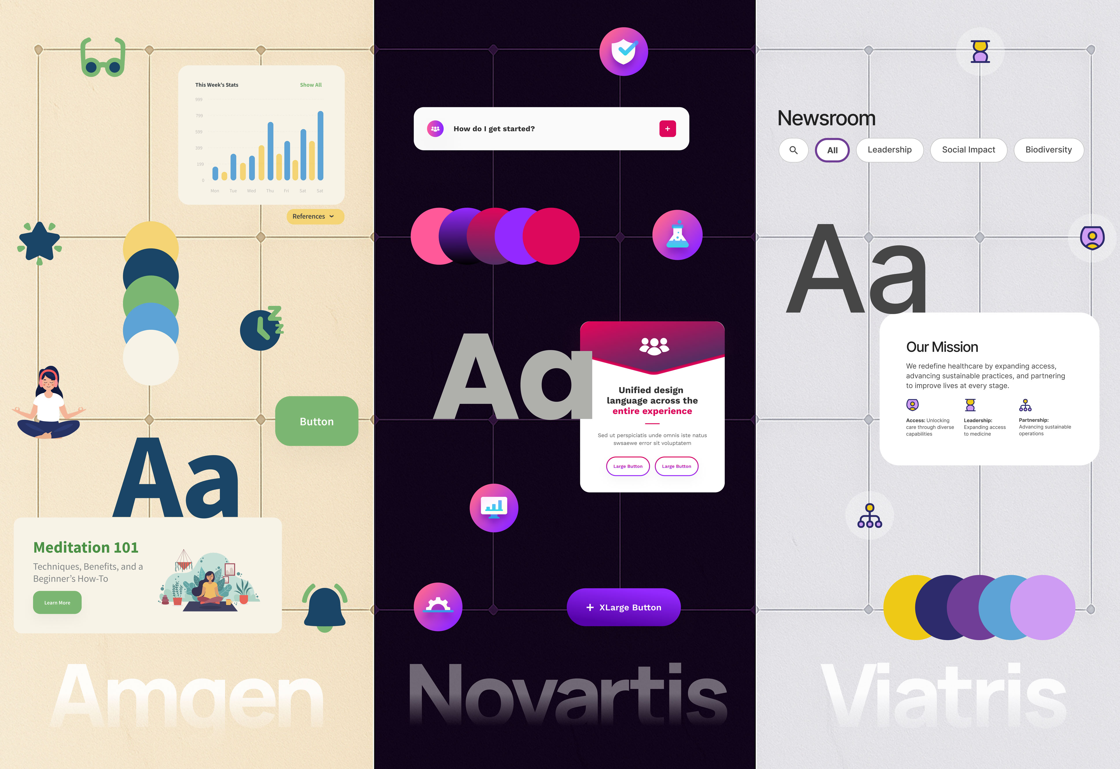
Across these systems I learned that scalability has to be baked in from the start, with lean tokens, variables, and modules that grow without becoming noise. Documentation only works if it is simple, connected, and searchable. Accessibility and motion have to be solved at the component level so every pattern holds up. Fast prototyping with real components lets teams test ideas early and ship with confidence. And the branding has to sit naturally inside the system so the experience feels both functional and emotionally grounded for the people who use it.

industry

Enterprise

industry

Enterprise

industry

Enterprise

industry

Enterprise

timeframe

4 systems over 5 years

timeframe

4 systems over 5 years

timeframe

4 systems over 5 years

timeframe

4 systems over 5 years

skills

Design Systems, Component Architecture, Token Management, Accessibility, Responsive UI, Motion Guidelines, Documentation, Prototyping

skills

Design Systems, Component Architecture, Token Management, Accessibility, Responsive UI, Motion Guidelines, Documentation, Prototyping

skills

Design Systems, Component Architecture, Token Management, Accessibility, Responsive UI, Motion Guidelines, Documentation, Prototyping

skills

Design Systems, Component Architecture, Token Management, Accessibility, Responsive UI, Motion Guidelines, Documentation, Prototyping

tools

Figma, Tokens Studio, Storybook, Framer, Notion

tools

Figma, Tokens Studio, Storybook, Framer, Notion

tools

Figma, Tokens Studio, Storybook, Framer, Notion

tools

Figma, Tokens Studio, Storybook, Framer, Notion

Sanofi’s enterprise design system, built to scale across brands while keeping a consistent visual language. It delivers clear UI patterns for sites, emails, and digital campaigns, and sets the foundation for expressive but controlled brand moments across the ecosystem.

Using the system to build the Wyield site keeps everything on brand and strips out visual noise so the key information stands out. Tokens and light motion cues support an emotional connection and help users navigate their condition with confidence and clarity.

This prototype is built around what users actually responded to in testing. They rejected gimmick-heavy campaigns and focused on four things: what the product is, how it helps them, what it costs, and proof it works for others. The layout reflects that. There is a benefit-first opener with motion, a clear testing and cost section for the three target groups, an MOA that explains how it works, and a testimonial path supported by short looping videos. Everything stays lightweight, simple to scan, and accessible despite the motion.

This build is fully responsive and designed with accessibility in mind, so the experience holds up across devices and screen sizes without losing clarity.

Results

View a prototype of the system at work.

Delivered four scalable systems built under fast turnarounds without losing clarity or consistency

Met evolving accessibility expectations ahead of 2025 requirements

Unified branding, components, and interaction patterns across large corporate ecosystems

View a prototype of the system at work.

Delivered four scalable systems built under fast turnarounds without losing clarity or consistency

Met evolving accessibility expectations ahead of 2025 requirements

Unified branding, components, and interaction patterns across large corporate ecosystems

View a prototype of the system at work.

Delivered four scalable systems built under fast turnarounds without losing clarity or consistency

Met evolving accessibility expectations ahead of 2025 requirements

Unified branding, components, and interaction patterns across large corporate ecosystems

View a prototype of the system at work.

Delivered four scalable systems built under fast turnarounds without losing clarity or consistency

Met evolving accessibility expectations ahead of 2025 requirements

Unified branding, components, and interaction patterns across large corporate ecosystems

Learnings

Prototyping works best when timing tokens and interaction rules are baked into the system early

Motion rules need to live at the component level so personality and clarity stay consistent across branding

Brand teams need clear system guidelines so assets stay flexible, usable, and technically sound

Systems scale cleanly when structure and documentation stay lean, connected, and easy for teams to adopt

i'm open for work and freelance projects, feel free to email me to see how we can collaborate

i'm open for work and freelance projects, feel free to email me to see how we can collaborate

i'm open for work and freelance projects, feel free to email me to see how we can collaborate

i'm open for work and freelance projects, feel free to email me to see how we can collaborate